Thank you
At first we would like to say thank you for choosing Master Slider jQuery. In this documentation you will find everything you need to use Master Slider.
If you have any questions which are not covered in this documentation, please take a look at support section.
About the Master Slider jQuery
Master Slider jQuery is a premium high quality designed image and content slider for any purposes, with super smooth hardware accelerated transitions. It supports touch navigation with pure swipe gesture that you have never experienced before. It is a truly responsive and device friendly slider which works perfect in all major devices. Master Slider is an awesome layer slider as well, with the ability of adding any HTML contents (texts, images, …) in layers. It is easy to use, plus there are ready to use templates available for you. You almost have everything in Master slider which is the most complete among the best, hotspots, thumbnails, variety of effects, Video support and much more.
Quick Start
Step 1: Link required files
At first you need to insert required files into your page. Go to "quick-start" folder in downloaded package and upload "masterslider" folder to your server then add required files into your page like following (usually in <head> section):
						<!-- Base MasterSlider style sheet -->
						<link rel="stylesheet" href="masterslider/style/masterslider.css" />

						<!-- MasterSlider default skin -->
						<link rel="stylesheet" href="masterslider/skins/default/style.css" />

						<!-- Latest version of jQuery from Google CDN -->
						<!-- You can remove it if jQuery is already included. -->
						<script src="http://ajax.googleapis.com/ajax/libs/jquery/1/jquery.min.js"></script>

						<!-- MasterSlider main JS file -->
						<script src="masterslider/masterslider.min.js"></script>
Step 2: Slider HTML
Insert following HTML to the <body> section. This HTML defines your slider content. The "ms-skin-default" CSS class name means that the slider uses default skin, you need to change it if you've included a different skin CSS file in Step 1.
					<!-- masterslider -->
					<div class="master-slider ms-skin-default" id="masterslider">
						<!-- new slide -->
						<div class="ms-slide">

							<!-- slide background -->
							<img src="masterslider/blank.gif" data-src="masterslider/images/1.jpg" alt="lorem ipsum dolor sit"/>

							<!-- slide text layer -->
							<div class="ms-layer ms-caption" style="top:10px; left:30px;">
								Lorem ipsum dolor sit amet
							</div>

						</div>
						<!-- end of slide -->

						<!-- new slide -->
						<div class="ms-slide">

							<!-- slide background -->
							<img src="masterslider/blank.gif" data-src="masterslider/images/2.jpg" alt="lorem ipsum dolor sit"/>

							<!-- slide text layer -->
							<div class="ms-layer ms-caption" style="top:10px; left:30px;">
								Lorem ipsum dolor sit amet
							</div>

							<!-- linked slide -->
							<a href="http://codecanyon.net/user/averta">Averta</a>

						</div>
						<!-- end of slide -->

						<!-- new slide -->
						<div class="ms-slide">

							<!-- slide background -->
							<img src="masterslider/blank.gif" data-src="masterslider/images/3.jpg" alt="lorem ipsum dolor sit"/>

							<!-- slide text layer -->
							<div class="ms-layer ms-caption" style="top:10px; left:30px;">
								Lorem ipsum dolor sit amet
							</div>

							<!-- youtube video -->
							<a href="http://www.youtube.com/embed/YHWkro9-e9Q?hd=1&wmode=opaque&controls=1&showinfo=0" data-type="video">Youtube video</a>

						</div>
						<!-- end of slide -->

					</div>
					<!-- end of masterslider -->
Step 3: Initialize
Insert the following JavaScript after slider HTML (usually after <body> section).
					<script>
						var slider = new MasterSlider();
						slider.setup('masterslider' , {
								width:800,    // slider standard width
								height:350,   // slider standard height
								space:5
								// more slider options goes here...
								// check slider options section in documentation for more options.
							});
						// adds Arrows navigation control to the slider.
						slider.control('arrows');
					</script>
Looking for jQuery plugin style initialization? check Using jQuery Plugin.
Slider Options
You can use/change following options in slider setup method.
For example:
						<script>
							var slider = new MasterSlider();
							slider.setup('masterslider' , {
									width:800,    // slider standard width
									height:350,   // slider standard height
									space:5,
									fullwidth:true,
									autoHeight:true,
									view:"mask"
									// more slider options goes here...
								});
							// adds Arrows navigation control to the slider.
							slider.control('arrows');
						</script>
| Option Name |
Default Value |
Description |
| width |
300 |
The base width of slides. It helps the slider to resize in correct ratio. |
| height |
150 |
The base height of slides, It helps the slider to resize in correct ratio. |
| start |
1 |
The slider starting slide number. |
| space |
0 |
The spacing value between slides in pixels. |
| grabCursor |
true |
Whether the slider uses grab mouse cursor. |
| swipe |
true |
Whether the drag/swipe navigation is enabled. |
| mouse |
true |
Whether the user can use mouse drag navigation. |
| wheel |
false |
Enables mouse scroll wheel navigation. |
| keyboard |
false |
Enables keyboard navigation. |
| autoplay |
false |
Enables the autoplay slideshow. |
| loop |
false |
Enables the continuous sliding mode. |
| shuffle |
false |
Enables the shuffle slide order. |
| preload |
0 |
Specifies number of slides which will be loaded by slider. 0 value means slider will load slides in sequence and "all" value means slider will load all of the slides at starting. This option is only effective for images which has "data-src" attribute. |
| layout |
"boxed" |
Since v1.5.7
Specifies layout of the slider, it accepts following values:
- boxed: The default layout of slider, size of the slider does not exceed the specified width and height in slider options.
- fullwidth: Forces the slider to adapt width to the browser width.
- fullscreen: Forces the slider to adapt width and height to the browser window dimension.
- fillwidth: Enables the slider to adapt width to its parent element.
- autofill: Enables the slider to adapt width and height to its parent element.
- partialview: It's like the boxed layout but nearby slides are always visible.
|
| fullscreenMargin |
0 |
Specifies margin space at the bottom of slider, it only affects with "fullscreen" layout. |
| heightLimit |
false |
It force the slide to use max height value as its base specified height value. |
| autoHeight |
false |
Whether the slider adapts its height to each slide height or not. It overrides heightLimit option. |
| smoothHeight |
true |
Whether the slider uses smooth animation while its height changes. |
| endPause |
false |
Whether the slider pauses slideshow when it reaches to last slide. |
| overPause |
false |
Whether the slider pauses slideshow on hover. |
| fillMode |
"fill" |
Specifies the slide background scaling method. Its acceptable values are "fill", "fit", "stretch", "center" and "tile". |
| centerControls |
true |
Whether the slider aligns UI controls to center. This option is only effective in full width mode. |
| layersMode |
"center" |
It accepts two values "center" and "full". The "center" value indicates that the slider aligns layers to the center. This option is only effective in full width mode. |
| instantStartLayers |
false |
Whether start show transition of layers before slide transition complete. |
| parallaxMode |
"mouse" |
Since v1.7.0
Specifies type of layers parallax move, it accepts below values:
- "mouse": It moves the layers while mouse is moving
- "swipe": It moves layers while slider is sliding or swiping.
- "mouse:x-only": It moves the layers only on X-axis while mouse is moving (horizontally moves).
- "mouse:y-only": It moves the layers only on Y-axis while mouse is moving (vertically moves).
|
| filters |
null |
Applys CSS3 filters to slide transition views. For more information check Adding CSS3 filters. |
| hideLayers |
false |
Whether the slider hides all layers before changing slide. |
| speed |
17 |
Specifies slide changing speed. It accepts float values between 0 and 100. |
| dir |
"h" |
Specifies slide changing direction. It accepts two values "h" (horizontal) and "v" (vertical). |
| view |
"basic" |
The slide changing transition. More info here... |
| deepLink |
null |
A unique name for the slider which will be used in browser address bar you can enter your own name otherwise slider generates a unique one. |
| deepLinkType |
"path" |
Specifies the type of displaying slider deeplinking permalink in the address bar. acceptable values: "paht" and "query" |
| startOnAppear |
false |
It initializes slider when slider comes inside of browser window when scrolling. |
Using Master Slider jQuery Plugin
Since version 2.0, you can setup slider by using Master Slider jQuery Plugin.
There is no difference between js pure slider setup and jQuery plugin setup you can use all options in both of them.
						$('#slider').masterslider({
							width: 700,
							height: 560,
							// more options...
							controls : {
								arrows : {autohide:false},
								bullets : {}
								// more slider controls...
							}
						});
You can see list of all options here...
controls options in plugin specifies slider controls for more information check Slider UI Controls.
In some cases, you may need to access to the slider js object from jQuery plugin instance, you can simply access to it like below code:
var slider_obj = $('#slider').masterslider('slider');
Also you can simply use slider api methods:
						$('#slider').masterslider('gotoSlide' , 3); // moves to 4th slide.
						$('#slider').masterslider('destroy');
And you can bind slider events like:
						$('#slider').on(MSSliderEvent.CHANGE_START, function(e){
							// dispatches when the slider's current slide change starts.
						});
For more information about slider api methods and events check Slider API.
Slider HTML Element
MasterSlider defines with a <div> element which has "masterslider" as class name and each slide must be added in it.
						<!-- masterslider -->
						<div class="master-slider ms-skin-default" id="masterslider">
							<!-- slides goes here -->
						</div>
						<!-- end of masterslider -->
Note: The second class name in slider element specifies slider skin.
More info here...
Slides
Each slide in the slider HTML defines by a <div> element which has "ms-slide" as class name , like following:
						<!-- masterslider -->
						<div class="master-slider ms-skin-default" id="masterslider">
							<!-- new slide -->
							<div class="ms-slide" data-fill-mode="fit" data-delay="5">

								<!-- slide background -->
								<img src="masterslider/blank.gif" data-src="masterslider/images/1.jpg" alt="lorem ipsum dolor sit"/>

							</div>
							<!-- end of slide -->

							<!-- new slide -->
							<div class="ms-slide">

								<!-- slide background -->
								<img src="masterslider/blank.gif" data-src="masterslider/images/2.jpg" alt="lorem ipsum dolor sit"/>

							</div>
							<!-- end of slide -->

							<!-- new slide -->
							<div class="ms-slide">

								<!-- slide background -->
								<img src="masterslider/blank.gif" data-src="masterslider/images/3.jpg" alt="lorem ipsum dolor sit"/>

							</div>
							<!-- end of slide -->

						</div>
						<!-- end of masterslider -->
Slide Parameters
| Name |
Default Value |
Description |
| data-delay |
3 |
The time duration for moving to next slide in seconds |
| data-fill-mode |
Value of fillMode in slider Options |
Specifies the slide background scaling method. Its acceptable values are "fill", "fit", "stretch", "center" and "tile". |
Video Backgrounds
Video backgrounds are supported in IE9+ and all other modern browsers and major touch devices.
						<!-- masterslider -->
						<div class="master-slider ms-skin-default" id="masterslider">
							<!-- new slide -->
							<div class="ms-slide" data-fill-mode="fit" data-delay="5">

								<!-- slide background -->
								<img src="masterslider/blank.gif" data-src="masterslider/images/1.jpg" alt="lorem ipsum dolor sit"/>

								<!-- slide background video -->
								<video data-autopause="false" data-mute="true" data-loop="true" data-fill-mode="fill">
									<source id="mp4" src="http://media.w3.org/2010/05/bunny/trailer.mp4" type="video/mp4"/>
									<source id="ogv" src="http://media.w3.org/2010/05/bunny/trailer.ogv" type="video/ogg"/>
								</video>

							</div>
							<!-- end of slide -->
						</div>
						<!-- end of masterslider -->
Video Parameters
| Name |
Default Value |
Description |
| data-mute |
true |
Whether the video is muted. |
| data-loop |
true |
Whether the video is looped. |
| data-autopause |
false |
Whether the slider pauses the video before changing slide then resume it or always starts it from beginning. |
| data-fill-mode |
fill |
Specifies the video scaling method. Its acceptable values are "fill", "fit", "none". |
Adding CSS3 Filters
Since version 2.12.0 you can add CSS3 filters to slide transitions.
You need to define filters as a object for filters option in slider options. Below is an example
							var slider = new MasterSlider();
							slider.control('arrows');
							slider.control('thumblist' , {autohide:false ,dir:'h',arrows:false});
							slider.control('bullets');

							slider.setup('masterslider' , {
									width:900,
									height:600,
									space:5,
									fillMode:'fit',
									preload:0,
									view:'basic',
									filters: {
										grayscale: 1,
										opacity: 0.5,
										brightness: 2
									}
							});
You can specify filtering target with filterTarget option. It accpets "slide" and "bg" values
For more information about CSS3 Filters please check this document.
Note CSS3 Filters doesn't support in all browsers and in some it dosn't have good performance. You can check browser support here.
Note Master Slider doesn't support "drop-shadow" filter.
Slide Contents
-
Slide Background Image
The first <img> element in the slide specifies the slider background image.
Note: This slider supports preloading feature (It helps slider to load faster). For using this feature you need to specify image path as "data-src" instead of "src".
						<!-- new slide -->
						<div class="ms-slide">

							<!-- slide background  -->
							<img src="masterslider/blank.gif" data-src="masterslider/images/3.jpg" alt="lorem ipsum dolor sit"/>

						</div>
						<!-- end of slide -->
-
Slide Thumbnail Image
It specifies by an <img> element which has "ms-thumb" as class name .
						<!-- new slide -->
						<div class="ms-slide">

							<!-- slide background -->
							<img src="masterslider/blank.gif" data-src="masterslider/images/3.jpg" alt="lorem ipsum dolor sit"/>

							<!-- slide thumbnail Image -->
							<img class="ms-thumb" src="masterslider/images/thumbs/5.jpg" alt="lorem ipsum dolor sit"/>

						</div>
						<!-- end of slide -->
-
Slide Link
It specifies by an <a> element.
						<!-- new slide -->
						<div class="ms-slide">

							<!-- slide background -->
							<img src="masterslider/blank.gif" data-src="masterslider/images/3.jpg" alt="lorem ipsum dolor sit"/>

							<!-- slide thumbnail Image -->
							<img class="ms-thumb" src="masterslider/images/thumbs/5.jpg" alt="lorem ipsum dolor sit"/>

							<!-- linked slide -->
							<a href="http://codecanyon.net/user/averta">Averta</a>

						</div>
						<!-- end of slide -->
-
Slide Video
It specifies by an <a> element which has custom attribute data-type:"video".
						<!-- new slide -->
						<div class="ms-slide">

							<!-- slide background -->
							<img src="masterslider/blank.gif" data-src="masterslider/images/3.jpg" alt="lorem ipsum dolor sit"/>

							<!-- slide thumbnail Image -->
							<img class="ms-thumb" src="masterslider/images/thumbs/5.jpg" alt="lorem ipsum dolor sit"/>

							<!-- youtube video -->
							<a href="http://www.youtube.com/embed/YHWkro9-e9Q?hd=1&wmode=opaque&controls=1&showinfo=0" data-type="video">Youtube video</a>

						</div>
						<!-- end of slide -->
Note: You can enable autplay video feature by adding data-autplay="true" attribute to the video element.
Note: This Slider supports Vimeo and Youtube videos, Please note that you need to find the video embed URL for adding it into the slider.
More info here...
-
Slide Layers
This slider supports three different type of layers,
text layer (html), image layer and video layer (vimeo and youtube).
Check "Slide Layers" section for more information.
						<!-- new slide -->
						<div class="ms-slide">

							<!-- slide background -->
							<img src="masterslider/blank.gif" data-src="masterslider/images/3.jpg" alt="lorem ipsum dolor sit"/>

							<!-- slide thumbnail Image -->
							<img class="ms-thumb" src="masterslider/images/thumbs/5.jpg" alt="lorem ipsum dolor sit"/>

							<!-- youtube video -->
							<a href="http://www.youtube.com/embed/YHWkro9-e9Q?hd=1&wmode=opaque&controls=1&showinfo=0" data-type="video">Youtube video</a>

							<!-- slide text layer -->
							<div class="ms-layer ms-caption" style="top:10px; left:30px;">
								Lorem ipsum dolor sit amet
							</div>

						</div>
						<!-- end of slide -->
Slide Layers
Each layer specifies by an element which has "ms-layer" as class name.
Since V2.1.0 you can disable swipe guesture over each layer by adding "ms-no-swipe" class name to the layer element.
Layer custom attributes:
These parameters are supported in any type of layers.
| Name |
Default Value |
Description |
| data-type |
"text" |
Specifies the type of layer. It accepts three values "text", "image", "video". |
| data-offset-x |
0 |
Specifies the X position of layer. |
| data-offset-y |
0 |
Specifies the Y position of layer. |
| data-position |
"normal" |
Since V2.12.0
Specifies type of positioning layer over slide
- "normal": layer adds over slide and moves with slide while swiping or chaning slide.
- "static": it's like "normal" but it doesn't accept layer effect and it always visible over slide.
- "fixed": layer adds over slider and doen't move while swiping or chaning slide.
Note Fixed layers in IE causes links on other layers with defferent type not working.
|
| data-origin |
"tl" |
Since V1.7.0
Specifies layer positioning origin over slide, it accepts below values:
- "tl": Top left
- "tc": Top center
- "tr": Top right
- "ml": Middle left
- "mc": Middle center
- "mr": Middle right
- "bl": Bottom left
- "bc": Bottom center
- "br": Bottom right
|
| data-widthlimit |
-1 |
Specifies the minimum value of the slider width which layer can visible, under this value slider hides the layer. |
| data-resize |
"true" |
Whether the slider resizes the layer when slider resizes. ("true" or "false") |
| data-fixed |
"false" |
Whether the slider reposition the layer when slider resizes. ("true" or "false") |
| data-effect |
"fade" |
Specifies layer show transition effect. More info here... |
| data-duration |
1000 |
Specifies how many milliseconds a show transition effect takes to complete. |
| data-delay |
0 |
Specifies when the show transition effect starts, in milliseconds. |
| data-ease |
"linear" |
Specifies the show transition effect timing method. You can find list of all functions here... |
| data-hide-effect |
null |
Specifies layer hide transition effect. More info here... |
| data-hide-duration |
null |
Specifies how many milliseconds a hide transition effect takes to complete. |
| data-hide-time |
null |
Specifies when the hide transition effect starts, in milliseconds. |
| data-hide-ease |
null |
Specifies the hide transition effect timing method. You can find list of all functions here... |
| data-parallax |
0 |
Specifies the intensity of parallax effect, higher values makes the layer more sensitive. Negative values are allowed. |
| data-action |
null |
Since V1.7.2
Specifies the action type of layer with will be called when user clicks layer. It accepts below values:
- "next": Goto next slide.
- "previous": Goto previous slide.
- "gotoSlide(slideNum)": goto specified slide (slideNum).
- "pause": Pause slider timer.
- "resume" Resume slider timer.
|
Example:
						<!-- new slide -->
						<div class="ms-slide">

							<!-- slide background -->
							<img src="masterslider/blank.gif" data-src="masterslider/images/3.jpg" alt="lorem ipsum dolor sit"/>

							<!-- slide text layer -->
							<div class="ms-layer ms-caption" style="top:10px; left:30px;">
								Lorem ipsum dolor sit amet
							</div>

							<!-- slide image layer -->
							<img class="ms-layer" alt="lorem ipsum dolor sit"
								 data-offset-x		= "10"
								 data-offset-y 		= "15"
								 data-origin		= "tr"
								 data-type 			= "image"
								 data-widthlimit 	= "600"
								 data-resize		= "false"
								 data-effect   		= "right(90)"
								 data-duration 		= "800"
								 data-ease	   		= "easeOutQuart"

								 src="masterslider/blank.gif"
								 data-src="masterslider/images/layer_img.png"
							/>

						</div>
						<!-- end of slide -->
Layer types:
-
Text Layer / Captions
It can defines by any type of html elements like headings (h1, h2, h3, ...), <p>, <div> and you can easily style it by css.
Note: It's important to add data-type = "text" attribute the layer element.
								<!-- slide text layer -->
								<div class="ms-layer ms-caption"
									 data-offset-x		= "10"
									 data-offset-y 		= "15"
									 data-origin		= "tr"
									 data-type 			= "text"
									 data-effect   		= "bottom(90)"
									 data-duration 		= "800"
									 data-ease	   		= "easeOutQuart"

								>
								 Lorem ipsum dolor sit amet
								</div>
-
Image Layer
Note: It's important to add data-type = "image" attribute the layer element.
Note: This slider supports preloading feature (It helps slider to load faster). For using this feature you need to specify image path as "data-src" instead of "src".
							<!-- slide image layer -->
							<img class="ms-layer" alt="lorem ipsum dolor sit"
								 data-offset-x		= "10"
								 data-offset-y 		= "15"
								 data-origin		= "tr"
								 data-type 			= "image"
								 data-effect   		= "right(90)"
								 data-duration 		= "800"
								 data-ease	   		= "easeOutQuart"

								 src="masterslider/blank.gif"
								 data-src="masterslider/images/layer_img.png"
							/>
-
Button Layer
Note: It's important to add data-type = "button" attribute the layer element.
							<!-- slide button layer -->
							<a class="ms-layer ms-btn myCustomBtn"
								 data-offset-x		= "10"
								 data-offset-y 		= "15"
								 data-origin		= "tr"
								 data-type 			= "button"
								 data-effect   		= "right(90)"
								 data-duration 		= "800"
								 data-ease	   		= "easeOutQuart"
							>
								Learn More..
							</a>
-
Video Layer
Custom attributes:
| Name |
Default Value |
Description |
| data-autoplay |
"false" |
Whether auto play video or not. |
Note: It's important to add data-type = "video" attribute the layer element.
							<!-- slide video layer -->
							<div class="ms-layer" style="width:460px; height:259px"
								 data-offset-x		= "50"
								 data-offset-y 		= "15"
								 data-origin		= "tr"
								 data-type 			= "video"
								 data-effect   		= "bottom(90)"
								 data-duration 		= "800"
								 data-autoplay		= "true"
								 data-ease	   		= "easeOutQuart"
							>
								<!-- this img element displays as the video cover image. It's optional you can remove it and slider will show video player. -->
								<img src="masterslider/blank.gif" data-src="masterslider/images/cover_img.jpg" alt="lorem ipsum dolor sit" />
								<iframe src="http://www.youtube.com/embed/YHWkro9-e9Q?hd=1&wmode=opaque&controls=1&showinfo=0" width="460" height="259"> </iframe>
							</div>
Note: This Slider supports Vimeo and Youtube videos, Please note that you need to find the video embed URL for adding it into the slider.
More info here...
-
Hotspot Layer
Custom attributes:
| Name |
Default Value |
Description |
| data-align |
"bottom" |
Specifies the aligning position of hotspot tooltip (left, right, top and bottom). |
| data-stay-hover |
"false" |
Whether shows tooltip while user mouse over it. |
Note: It's important to add data-type = "hotspot" attribute the layer element.
							    		LOREM IPSUM DOLOR
							    		Lorem ipsum dolor sit amet, consectetuer adipiscing elit, sed diam nonummy nibh euismod tincidunt.
Flickr Plugin
Step 1: Link required files
At first you need to insert Flickr plugin JS file into your page. Go to "quick-start/masterslider" folder in downloaded package and upload "masterslider.flickr.js" file to your server then add required file into your page like following (usually in <head> section)be informed all the Master Slider required files should be imported already.
						<!-- MasterSlider Flickr plugin JS file -->
						<script src="masterslider/masterslider.flickr.min.js"></script>
Step 2: Slider HTML
Insert following HTML to the <body> section. This HTML defines the main slider container.
					<!-- masterslider Flickr-->

					<!-- end of masterslider Flickr-->
Step 3: Initialize
Insert the following JavaScript after slider HTML (usually after <body> section).
					<script>
						var slider = new MasterSlider();
						slider.setup('masterslider' , {
								width:900,
								height:600,
								space:5,
								fillMode:'fit',
								preload:0,
								view:'basic'
						});

						slider.control('arrows');
						slider.control('thumblist' , {autohide:false ,dir:'h',arrows:false});
						slider.control('bullets');

						var flkr = new MSFlickr(slider , {key:'[Your Flickr API key]' , id:'[Photoset or User ID]' , desc:false , count:10});
					</script>
| Option Name |
Default |
Description |
| slider |
- |
The Master Slider object for Flickr plugin.(required) |
| type |
photoset |
This option accepts two values "photoset" and "latest", "photoset" for showing photoset pictures and "latest" for showing latest pictures. |
| id |
- |
It depends to option type,it should be photoset's ID if type set to "photoset" and it should be user's ID if type set to "latest". |
| key |
- |
The Flickr api key.(required) |
| imgSize |
c |
This option accepts four values "-", "z", "c" and "b" ,
"-" for medium size with dimension of 500 on longest side,
"z" for medium size with dimension of 640 on longest side,
"c" for medium size with dimension of 800 on longest side,
and "b" for large size with dimension of 1024 on longest side. |
| count |
10 |
The number of images. It helps the slider to put exact number of pictures. |
| autoplayDelay |
4 |
This option determine the time of showing each slide in autoplay mood. |
| thumbs |
true |
It shows thumbs if it sets to "true", it doesn't show thumbs if it sets to "false". |
| thumbSize |
q |
This option accepts three values "s", "q" and "t" ,
"s" for small square with dimension of "75x75",
"q" for large square with dimension of "150x150"
and "t" for thumbnail with dimension of 100 on longest side. |
| title |
true |
It shows title of image if it sets to "true", it doesn't show title of image if it sets to "false". |
| author |
true |
It shows author of image if it sets to "true", it doesn't show author of image if it sets to "false". |
| desc |
false |
It shows the image description if it sets to "true", It doesn't show the image description if it sets to "false". |
| titleEff |
fade |
This option determine the effect of title on slider, please refer to Layer Transition Effects for more information about the variety of effects. |
| authorEff |
fade |
This option determine the effect of author on slider, please refer to Layer Transition Effects for more information about the variety of effects. |
| descEff |
fade |
This option determine the effect of description on slider, please refer to Layer Transition Effects for more information about the variety of effects. |
Note: to achieve user's ID you can use this Flickr get ID and to achieve photoset's ID you can take it from photoset page url.
Adding Scroll Parallax Effect To The Slider
Since version 2.0 you can add parallax effect to the slider which will appears when user scrolls, you can simply enable it by adding one line js after slider setup js code like below example:
						var slider = MasterSlider();
						slider.setup('slider_id', {
							width:700,
							height:550
							// more options ...
						});

						// add scroll parallax effect
						MSScrollParallax.setup(slider,50,80,true);
MSScrollPrallax Parameters
MSScrollParallax.setup(slider_instance, layers_parallax_depth, background_parallax_depth, fade_layers);
Parameters
| Name |
Default |
Description |
| Slider Instance |
- |
The Master Slider instance |
| Layers Parallax Depth |
50 |
The intensity of parallax effect, higher values makes the layer more sensitive. Negative values are allowed. |
| Background Parallax Depth |
40 |
The intensity of slide background parallax effect, higher values makes the background image more sensitive. Negative values are allowed. |
| Fade Layers |
false |
Whether fade layers while scrolling or not. |
Note If you are using Master Slider jQuery Plugin setup you can access to the slider instance object with:
var slider_instance = $('#slider').masterslider('slider');
Layer Transition Effects
You can create unlimited transition effects for layers by using slider preset effect functions.
Each function may have some parameters, here is some custom parameter values:
-
short: equals to 30
-
long: equals to 300
-
random value: min|max for example 10|300 (it takes a random value between 10 and 300)
Rotation origin:
-
tl: equals to top left
-
tr: equals to top right
-
bl: equals to bottom left
-
br: equals to bottom right
-
t: equals to top
-
b: equals to bottom
-
r: equals to right
-
l: equals to left
-
c: equals to center
Example: right(short)
Here is the list of all preset transition functions:
| Name |
Parameters |
Description |
Example |
| fade |
- |
show: fade in
hide : fade out |
fade() |
| left |
distance , fade (true or false) |
show: moves from left
hide : moves to left |
left(short,false) |
| right |
distance , fade (true or false) |
show: moves from right
hide : moves to right |
right(100,true) |
| top |
distance , fade (true or false) |
show: moves from top
hide : moves to top |
top(100) |
| bottom |
distance , fade (true or false) |
show: moves from bottom
hide : moves to bottom |
bottom(100|500 , true) |
| rotate |
deg , orig |
show: rotate in
hide : rotate out |
rotate(300 , br) |
| rotateleft |
deg , dist , orig , fade (true or false) |
show: rotate from left
hide : rotate to left |
rotateleft(45|180,long,br,true) |
| rotateright |
deg , dist , orig , fade (true or false) |
show: rotate from right
hide : rotate to right |
rotateleft(45|180,long,br,true) |
| rotatetop |
deg , dist , orig , fade (true or false) |
show: rotate from top
hide : rotate to top |
rotatetop(45|180,long,br,true) |
| rotatebottom |
deg , dist , orig , fade (true or false) |
show: rotate from bottom
hide : rotate to bottom |
rotatebottom(45|180,long,br,true) |
| skewleft |
deg , dist , fade (true or false) |
show: skew from left
hide : skew to left |
skewleft(18,35|100) |
| skewright |
deg , dist , fade (true or false) |
show: skew from right
hide : skew to right |
skewright(18,35|100) |
| skewtop |
deg , dist , fade (true or false) |
show: skews from right
hide : skew to right |
skewtop(18,35|100,false) |
| skewbottom |
deg , dist , fade (true or false) |
show: skews from bottom
hide : skew to bottom |
skewbottom(18,35|100) |
| front |
dist , fade (true or false) |
show: moves from front (3D)
hide : moves to front (3D) |
front(300) |
| back |
dist , fade (true or false) |
show: moves from back (3D)
hide : moves to back (3D) |
back(300) |
| rotatefront |
deg , dist, orig , fade (true or false) |
show: rotate from front (3D)
hide : rotate to front (3D) |
rotatefront(300 , 500 ,c , true) |
| rotateback |
deg , dist , orig , fade (true or false) |
show: rotate from back (3D)
hide : rotate to back (3D) |
rotateback(300 , 500 ,c , true) |
| rotate3dleft |
x , y , z , dist , orig , fade |
show: 3D rotate from left
hide : 3D rotate to left |
rotate3dleft(50 , 0 , 10, short,c,true) |
| rotate3dright |
x , y , z , dist , orig , fade |
show: 3D rotate from right
hide : 3D rotate to right |
rotate3dright(50 , 0 , 10, short,c,true) |
| rotate3dtop |
x , y , z , dist , orig , fade |
show: 3D rotate from top
hide : 3D rotate to top |
rotate3dtop(50 , 0 , 10, short,c,true) |
| rotate3dbottom |
x , y , z , dist , orig , fade |
show: 3D rotate from bottom
hide : 3D rotate to bottom |
rotate3dbottom(50 , 0 , 10, short,c,true) |
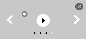
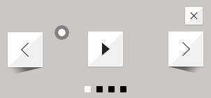
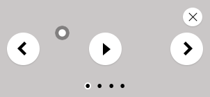
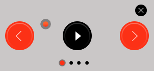
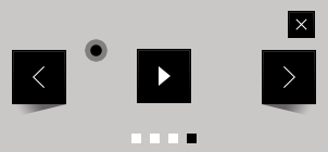
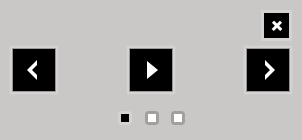
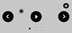
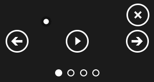
Slider UI Controls
UI Controls adds to the slide with "control" slider method.
					var slider = new MasterSlider();
					slider.setup('masterslider' , {width:800, height:350});
					slider.control('arrows'); // here we've added arrow control to the slider.
UI Controls:
-
arrows
Adds arrow navigation to the slider. css class names: "ms-nav-next" and "ms-nav-prev"
Options:
| Name |
Default Value |
Description |
| autohide |
true |
Whether the control hides when mouse leaves the slider. |
| overVideo |
true |
Whether the control visible over slide video while playing. |
| hideUnder |
null |
Hides the control if width of slider comes less than specified. |
Example:
						var slider = new MasterSlider();
						slider.setup('masterslider' , {width:800, height:350});
						slider.control('arrows' , {autohide:false}); // here we've added arrow control to the slider.
-
bullets
This UI control adds one bullet for each slide and user can change slide by clicking on each bullet.
css class name: "ms-bullets"
Options:
| Name |
Default Value |
Description |
| autohide |
true |
Whether the control hides when mouse leaves the slider. |
| overVideo |
true |
Whether the control visible over slide video while playing. |
| dir |
"h" |
Specifies the direction of control. It accepts two values "h" (horizontal) and "v" (vertical) |
| hideUnder |
null |
Hides the control if width of slider comes less than specified. |
| align |
"bottom" |
Aligns the control to in or out of slider. It accepts "top" and "bottom" values. |
| margin |
10 |
Specifies the space between the control and slider in pixel. |
Example:
						var slider = new MasterSlider();
						slider.setup('masterslider' , {width:800, height:350});
						slider.control('bullets' , {autohide:false  , dir:"v", align:"top"});
-
thumblist
This control searches for an element which has "ms-thumb" as class name in slider html then creates a list of thumbnails.
css class name: "ms-thumb-list"
Note: You can create a div element with "ms-thumb" class name in each slide and use html instead of image in thumbnail list. Like following:
							<!-- new slide -->
							<div class="ms-slide">

								<!-- slide background -->
								<img src="masterslider/blank.gif" data-src="masterslider/images/3.jpg" alt="lorem ipsum dolor sit"/>

								<!-- slide text title it shows in thumbnail list. -->
								<div class="ms-thumb">lorem ipsum</div>

							</div>
							<!-- end of slide -->
Options:
| Name |
Default Value |
Description |
| autohide |
true |
Whether the control hides when mouse leaves the slider. |
| overVideo |
true |
Whether the control visible over slide video while playing. |
| width |
100 |
Specifies the width of each thumb in pixel. |
| height |
100 |
Specifies the height of each thumb in pixel. |
| type |
"thumbs" |
Specifies the type of control, it can used as "thumbs" or "tabs". |
| dir |
"h" |
Specifies the direction of control. It accepts two values "h" (horizontal) and "v" (vertical) |
| speed |
17 |
Specifies scrolling speed. It accepts float values between 0 and 100. |
| hideUnder |
null |
Hides the control if width of slider comes less than specified. |
| align |
"bottom" |
Aligns the control to in or out of slider. It accepts "top", "bottom", "left" and "right" values. |
| hover |
false |
Whether change slides on hovering over thumbs. |
| arrows |
false |
Whether add arrows in thumblist |
| inset |
false |
Whether insert the control inside or outside of slider. |
| margin |
10 |
Specifies the space between the control and slider in pixel. |
| space |
10 |
Specifies the space between thumbs or tabs. |
Example:
						var slider = new MasterSlider();
						slider.setup('masterslider' , {width:800, height:350});
						slider.control('bullets');
						slider.control('thumblist' , {autohide:false  , dir:"v"});
-
scrollbar
This UI control adds a scroll bar in slider which moves when each slide changes.
css class name: "ms-sbar"
Options:
| Name |
Default Value |
Description |
| autohide |
true |
Whether the control hides when mouse leaves the slider. |
| overVideo |
true |
Whether the control visible over slide video while playing. |
| dir |
"h" |
Specifies the direction of control. It accepts two values "h" (horizontal) and "v" (vertical) |
| color |
"#3D3D3D" |
Specifies the color scrollbar handle color. |
| width |
4 |
Specifies the width of scrollbar handle in pixel. |
| hideUnder |
null |
Hides the control if width of slider comes less than specified. |
| align |
"bottom" |
Aligns the control to in or out of slider. It accepts "top", "bottom", "left" and "right" values. |
| inset |
false |
Whether insert the control inside or outside of slider. |
| margin |
10 |
Specifies the space between the control and slider in pixel. |
Example:
						var slider = new MasterSlider();
						slider.setup('masterslider' , {width:800, height:350});
						slider.control('thumblist' , {autohide:false  , dir:"vertical"});
						slider.control('scrollbar' , {dir:"v"});
-
circletimer
It adds a circle timer into slider. This control only works in modern browsers.
css class name: "ms-ctimer"
Options:
| Name |
Default Value |
Description |
| autohide |
true |
Whether the control hides when mouse leaves the slider. |
| overVideo |
true |
Whether the control visible over slide video while playing. |
| color |
"#A2A2A2" |
Specifies the color of circle timer. |
| radius |
4 |
Specifies the radius of circle timer in pixels. |
| stroke |
10 |
Specifies the stroke of circle timer in pixels. |
| hideUnder |
null |
Hides the control if width of slider comes less than specified. |
Example:
						var slider = new MasterSlider();
						slider.setup('masterslider' , {width:800, height:350});
						slider.control('thumblist' , {autohide:false  , dir:"v"});
						slider.control('circletimer' , {color:"#FFDD00" , stroke:20});
-
timebar
It adds a progress bar for timer in slider.
css class name: "ms-timerbar"
Options:
| Name |
Default Value |
Description |
| autohide |
true |
Whether the control hides when mouse leaves the slider. |
| overVideo |
true |
Whether the control visible over slide video while playing. |
| color |
"#FFFFFF" |
Specifies the color of timebar. |
| hideUnder |
null |
Hides the control if width of slider comes less than specified. |
| align |
"bottom" |
Aligns the control to in or out of slider. It accepts "top" and "bottom" values. |
| inset |
false |
Whether insert the control inside or outside of slider. |
| margin |
0 |
Specifies the space between the control and slider in pixel. |
Example:
						var slider = new MasterSlider();
						slider.setup('masterslider' , {width:800, height:350});
						slider.control('timebar');
-
slideinfo
With this control you can specify a HTML value to each slide and slider will show the value of slide while it selected.
This control searches for an element which has "ms-info" as class name in each slide.
Options:
| Name |
Default Value |
Description |
| autohide |
true |
Whether the control hides when mouse leaves the slider. |
| overVideo |
true |
Whether the control visible over slide video while playing. |
| insertTo |
- |
The HTML element that the info will be added in it. |
| size |
100 |
Specifies the width or height (based on specified direction) of slide info container in pixel. |
| hideUnder |
null |
Hides the control if width of slider comes less than specified. |
| align |
"bottom" |
Aligns the control to in or out of slider. It accepts "top", "bottom", "left" and "right" values. |
| inset |
false |
Whether insert the control inside or outside of slider. |
| margin |
10 |
Specifies the space between the control and slider in pixel. |
Example:
						var slider = new MasterSlider();
						slider.setup('masterslider' , {width:800, height:350});
						slider.control('slideinfo',{insertTo:'#info'});
Slide Changing Transitions
You can change type of slide transitions in slider options.
Transition Types:
-
basic
						var slider = new MasterSlider();
						slider.setup('masterslider' , {width:800, height:350 , view:"basic"});
-
fade
						var slider = new MasterSlider();
						slider.setup('masterslider' , {width:800, height:350 , view:"fade"});
-
mask
						var slider = new MasterSlider();
						slider.setup('masterslider' , {width:800, height:350 , view:"mask"});
-
wave
						var slider = new MasterSlider();
						slider.setup('masterslider' , {width:800, height:350 , view:"wave"});
-
flow

						var slider = new MasterSlider();
						slider.setup('masterslider' , {width:800, height:350 , view:"flow"});
-
stack
									var slider = new MasterSlider();
									slider.setup('masterslider' , {width:800, height:350 , view:"stack"});
-
scale
									var slider = new MasterSlider();
									slider.setup('masterslider' , {width:800, height:350 , view:"scale"});
-
focus
									var slider = new MasterSlider();
									slider.setup('masterslider' , {width:800, height:350 , view:"focus"});
-
parallaxMask
									var slider = new MasterSlider();
									slider.setup('masterslider' , {width:800, height:350 , view:"parallaxMask"});
-
partialWave
									var slider = new MasterSlider();
									slider.setup('masterslider' , {width:800, height:350 , view:"partialWave"});
-
fadeBasic
									var slider = new MasterSlider();
									slider.setup('masterslider' , {width:800, height:350 , view:"fadeBasic"});
-
fadeWave
									var slider = new MasterSlider();
									slider.setup('masterslider' , {width:800, height:350 , view:"fadeWave"});
-
fadeFlow
									var slider = new MasterSlider();
									slider.setup('masterslider' , {width:800, height:350 , view:"scaleFlow"});
Slider API
Methods
					var slider = new MasterSlider();
					slider.setup('masterslider' , {width:800, height:350});

					slider.api.index(); 		// returns current slider index.
					slider.api.count(); 		// returns total number of slides.

					slider.api.next();			// next slide.
					slider.api.previous();  	// previous slide.
					slider.api.gotoSlide(4);	// moves to 4th slide.

					slider.api.pause();	 		// pauses the slider timer.
					slider.api.resume(); 		// resumes the slider timer.
					slider.api.currentTime(); 	// returns the percentage of elapsed time.

					slider.api.destroy(); 		// removes the slider.
Properties
					slider.api.so					// returns the object of slider options.

					slider.api.view					// returns the slider transition object.
					slider.api.view.slideList 		// returns a array of all slides.
					slider.api.viwe.currentSlide 	// returns the current slide object.
Events
					slider.api.addEventListener(MSSliderEvent.INIT , function(){
						// dispatches when the slider's current slide change starts.
					});

					slider.api.addEventListener(MSSliderEvent.CHANGE_START , function(){
						// dispatches when the slider's current slide change starts.
					});

					slider.api.addEventListener(MSSliderEvent.CHANGE_END , function(){
						// dispatches when the slider's current slide change ends.
					});

					slider.api.addEventListener(MSSliderEvent.WAITING , function(){
						// dispatches whenever the slider timer updates.
					});

					slider.api.addEventListener(MSSliderEvent.RESIZE , function(){
						// dispatches when the slider is resized.
					});

					slider.api.addEventListener(MSSliderEvent.VIDEO_PLAY , function(){
						// dispatches when the slide video played.
					});

					slider.api.addEventListener(MSSliderEvent.VIDEO_CLOSE , function(){
						// dispatches when the slide video closed.
					});

					slider.api.view.addEventListener(MSViewEvents.SWIPE_START , function(){
						// dispatches when swipe dragging starts.
					});

					slider.api.view.addEventListener(MSViewEvents.SWIPE_END , function(){
						// dispatches when swipe dragging ends.
					});

					slider.api.view.addEventListener(MSViewEvents.SWIPE_MOVE , function(){
						// dispatches when swipe dragging moves.
					});

					slider.api.view.addEventListener(MSViewEvents.SWIPE_CANCEL , function(){
						// dispatches when swipe dragging cancels.
					});
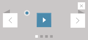
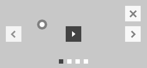
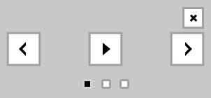
Slider Skins
Here you can find a list of available skins which included in dowload package.
You can change the slider skin by following these steps:
- Find and upload your preferred skin from "skins" folder.
-
Import "style.css" from the skin folder into your page like following:
<link rel="stylesheet" href="masterslider/skins/light-2/style.css" />
-
Specify skin class name to your slider element.
									<!-- masterslider -->
									<div class="master-slider ms-skin-light-2" id="masterslider">
										<!-- slides goes here -->
									</div>
									<!-- end of masterslider -->
Skins:
| |
Name |
Class Name |
 |
default |
ms-skin-default |
 |
Light 2 |
ms-skin-light-2 |
 |
Light 3 |
ms-skin-light-3 |
 |
Light 4 |
ms-skin-light-4 |
 |
Light 5 |
ms-skin-light-5 |
 |
Light 6 |
ms-skin-light-6 |
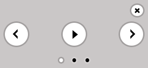 |
Light 6 Round |
ms-skin-light-6 ms-skin-round |
 |
Contrast |
ms-skin-contrast |
 |
Black 1 |
ms-skin-black-1 |
 |
Black 2 |
ms-skin-black-2 |
 |
Black 2 Round |
ms-skin-black-2 ms-skin-round |
 |
Metro |
ms-skin-metro |
Easing Functions
Important: This slider needs jQuery easing plugin for old browsers. You can include it into your page like following (in head section)
<script src="//cdnjs.cloudflare.com/ajax/libs/jquery-easing/1.3/jquery.easing.min.js"></script>
Supported Easing Functions
| Name |
Example |
| linear |
|
| easeInCubic |
|
| easeOutCubic |
|
| easeInOutCubic |
|
| easeInCirc |
|
| easeOutCirc |
|
| easeInOutCirc |
|
| easeInExpo |
|
| easeOutExpo |
|
| easeInOutExpo |
|
| easeInQuad |
|
| easeOutQuad |
|
| easeInOutQuad |
|
| easeInQuart |
|
| easeOutQuart |
|
| easeInOutQuart |
|
| easeInQuint |
|
| easeOutQuint |
|
| easeInOutQuint |
|
| easeInSine |
|
| easeOutSine |
|
| easeInOutSine |
|
| easeInBack |
|
| easeOutBack |
|
| easeInOutBack |
|
Finding YouTube/Viemo Embed URL
Open the video in YouTube/Vimeo, play video and right-click on it, select Copy embed code then paste the embed code in a text editor
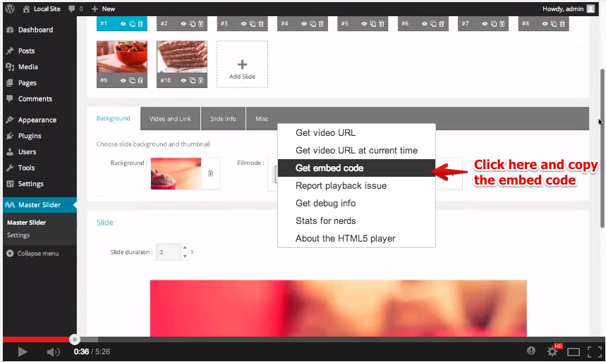
Now you can see video embed URL in embed code which specified as iframe src.
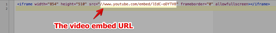
Finally in this example your embed url is : //www.youtube.com/embed/lEdC-oDYTVD
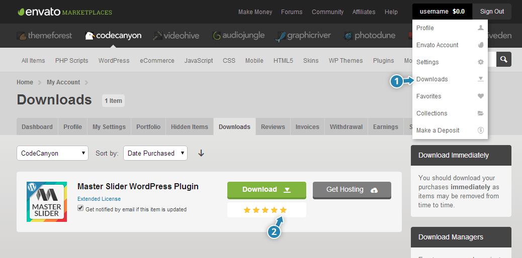
Rate Master Slider
Please login to your CodeCanyon account and navigate to your Downloads page and rate item as shown below.
Thanks in advance!
Support
If you have any questions please follow these steps:
- Please read item's Documentation
- Take a look in our FAQ page
- Take a look in Video Tutorials page
- Still have questions(s)? Create an Account in Support Forums (Find your “Item Purchase Code”)
- Use search field at the top of support forum for similar topics
- If you still didn't find your answers please post your question(s) in the item’s support forum
Our support staff are there to help you as soon as possible.
Why support forum?
- You can upload images and insert code with code-highlighting.
- It is organized and searchable (that makes support easier and faster)
Supporting our Items INCLUDES:
- Responding to questions or problems regarding our item and its features
- Fixing bugs and reported issues
- Providing updates to ensure compatibility with new software versions
Item support does NOT include:
- Customization and installation services
- Support for third party software and plug-ins
Important Note We CAN NOT provide support via email.
Please ask your support related questions only in our support forum.
Important Note For the fast troubleshooting, please send us detailed informations about the issue and make sure that you don't forget to send us your site url where you are using or want to use the item. Please note, that we cannot troubleshoot from screencast videos or screenshots.
Credits